Today, I’d like to talk about reading gravity.
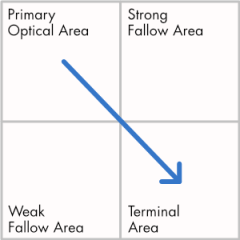
The general idea is illustrated by this drawing, known as the Gutenburg Diagram. The idea is this: All other things being equal, a reader will enter a page at the upper left, scan the contents in a series of sweeps from left to right, and exit at the lower right.
I don’t know if this has ever been proved, scientifically speaking, but it makes sense. At least for cultures using languages that read from left to right, top to bottom.
The key to the description is all other things being equal. In other words, this is how we read books and other printed matter that contain large masses of homogeneous text. When you add variation and contrast – images, color, or large type – you can override reading gravity and influence the way the reader scans the page.
Actually, the whole point of building visual and typographic hierarchies – a big part of our job as graphic designers – is to influence the way readers scan, read, and understand content. You are free to design as you see fit, but working with reading gravity instead of against it is almost always best. It’s a lesson I’ve had to relearn many times. When you neglect it, you do so at your peril.
As work progressed on the details of the HAWC infographic I’d more or less ignored the bigger picture: How is everything going to fit together for the reader? I did have a strong feeling that the original arrangement wasn’t going to work. Here’s why:

I’m going to assume that the images’s center of interest – the water tanks – will be the first thing to catch the reader’s eye. The arrows then trace a path through the information as it is intended to be read.
There are many problems here. The white backgrounds in the callouts add visual clutter. The arrangement of information is haphazard and obscures some of the most interesting parts of the background image. Worst of all the hierarchy requires some pretty serious visual gymnastics on the part of the reader. We’ve ignored reading gravity with a vengeance.
Revisions were definitely in order:

In the final version, the content is arranged to read more naturally from left to right, top to bottom. The callouts have been given dark backgrounds that blend naturally into the background while still containing and separating the information. And even though there is a fair amount of text and other information, the background panorama is almost entirely visible.
Hopefully, readers now will scan everything in the right order.
The final graphic, sans arrows:
